Isabelle von Boch Dishes on the Stately, Sophisticated Hue (and the Villeroy & Boch Collection That Beautifully Brings It to Life)
Interview & Article By Stephen Milioti
Haven’t thought much about lavender lately? Well, it’s time to give it a little attention again. Actually, more than a little. Because it’s way more versatile than you think. This refreshing hue is a design chameleon: Its more pink- and plum-leaning versions are expressive of nature’s bounty, and fit beautifully into a verdant country manor. But, on the other hand, the grayed-down versions are entirely at home in a chic urban loft.
This seasonless, inspiring color is in full effect in Villeroy & Boch’s Artesano Provençal Lavender line. Designed by renowned Belgian artist Isabelle de Borchgrave, it blends this intoxicating hue with classic floral patterns: a combination that’s entirely timeless, yet fresh-looking at once. It also represents a fascinating combination of artistic and cultural influences.
Who better to speak to about this elegant collection — and lavender in general — than Isabelle von Boch, the company’s brand ambassador (and an eighth-generation member of its founding family)? To that end, we asked her for her tips, thoughts, and inspirations when it comes to this subtly regal hue:
SM: What’s your connection to the color lavender?
IvB:  Well, personally, I have never owned any lavender or plum clothing because I have blue eyes and I think it fights blue. But I admire it everywhere else — for example, in a home interior. So even though it’s not my choice from a fashion or clothing standpoint, it fascinates me in porcelain. It’s softly sophisticated. It’s such an intoxicating hue to look at … it makes me want to breathe it in.
SM: Design-wise, what type of environment do you see lavender working best in?
IvB: Interestingly, a lot of people have the misconception that lavender is ultra feminine and frilly. But it’s not that at all. I see it working extremely well in a modern environment, set against a minimalist background, because it speaks so strongly on its own. I think it works extremely well as a subtle counterpoint or complement to sophisticated grays. It also just happens to work great with traditional décor, too.
SM: What colors and textures do you suggest pairing lavender with?
IvB: As I noted, it’s perfect with warm neutrals like gray and sand. But beyond that, it also works nicely next to muted colors like soft seafoam green. And I suggest pairing it alongside natural elements like stone, wood, and cement.
SM: Talk a little bit about the designs in the Artesano Provençal Lavender collection. You’ve regularly noted that this is one of your absolute favorite lines. What do you love so much about them?
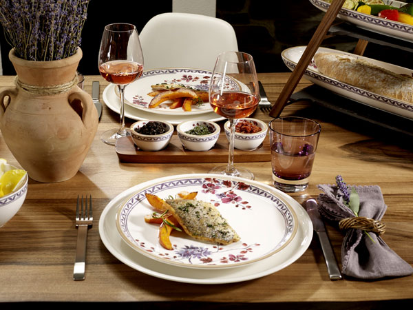
IvB: I love the depth of color and shading in the petals. At the same time, it’s clearly Provence-inspired, evident if you look at the florals, as well as the colors: lavender, rosemary and beige. To me, it’s also inspired by Japonism, a term for the influence of Japanese arts, fashion and material culture on European art, specifically the Impressionist and post-Impressionist eras. Monet, Klimt, Gauguin and van Gogh were all inspired by Japanese work as well. The designer of the collection, Isabelle de Borchgrave, aligns so beautifully with our brand because she’s able to combine these art-historical references flawlessly. The Artesano Provençal Lavender collection screams “art,” and I adore that. These designs have an emotional quality, a fluid line, with a depth of color that makes you want to “drink” them. The shape itself is warm and sculptural; its pronounced rim gives it an artisanal feel. It’s a sophisticated reinterpretation of florals.
SM: What are some of your favorite pieces in the collection?
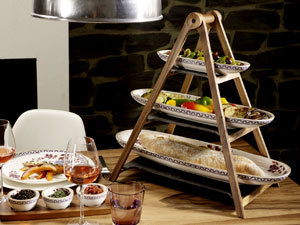 IvB: The pasta plates are my favorite. They’re so practical and generously sized, yet extremely beautiful at once. I love setting a table with a big white serving bowl in the middle and a pasta plate at each setting. Then add a charger and wood serving utensils for a mix of textures. I routinely suggest combining these lavender pieces with wood, cork and slate, to give the look warmth and bring out the Artesano Provençal Lavender’s handcrafted artisanal quality. (Try Villeroy & Boch’s three-tier étagère, made of acacia wood and slate.) It’ll make for a combination of urbanity and sophistication.
SM: You speak so much of a love of nature, both today and when you grew up in Provence. So we had to ask … would these styles work outdoors?
IvB: Yes, absolutely … they’re made for the outdoors, just as much as indoors. Just make sure to minimalize the décor around it. Pair it with neutral grass and lavenders, sage and muted greens — remember… seafoam green, not emerald — so as not to overpower the motif. Skip the bright flowers. Those work better with Amazonia, another one of my favorite Villeroy & Boch collections. (More on that one soon…)
SM: What kind of home design style do you think is best suited for this collection?
IvB: Artesano Provençal matches all different kinds of homes and styles: It fits into a country home as well as in a modern loft where it brings an element of nature onto the table. In elegant homes, it will add some casual European chic to the interior style. And imagine a table setting with Artesano Provençal on a rooftop, a terrace or in a garden to host family and friends outdoors – simply beautiful!